Since its release on Manchester’s Factory Records in June 1979, Joy Division’s debut album Unknown Pleasures (FACT 10) has captured the imagination of a diverse audience, ranging from reclusive adolescents sulking in their bedroom to celebrity scientists socialising with friends. The album has been critically acclaimed not just for the band’s distinctive musical style and sombre lead vocals performed by Ian Curtis, but also for the instantly recognizable album artwork designed by Peter Saville. At the time Saville created the album cover, he had recently graduated from Manchester Polytechnic with a first class degree in graphic design and was art director and co-founder of Factory Records.
The cover design of Unknown Pleasures uses a subtle combination of graphic techniques and typography to express sonic qualities of the album in addition to its enigmatic title, song lyrics, and stylistic choices made by members of Joy Division. Before discussing the relationship between Saville’s elegantly understated design work and the emergence of post-punk aesthetics, it is worth taking a closer look at specific ways in which the album cover casts light (and shadow) on scientific culture and practice of radio astronomy.
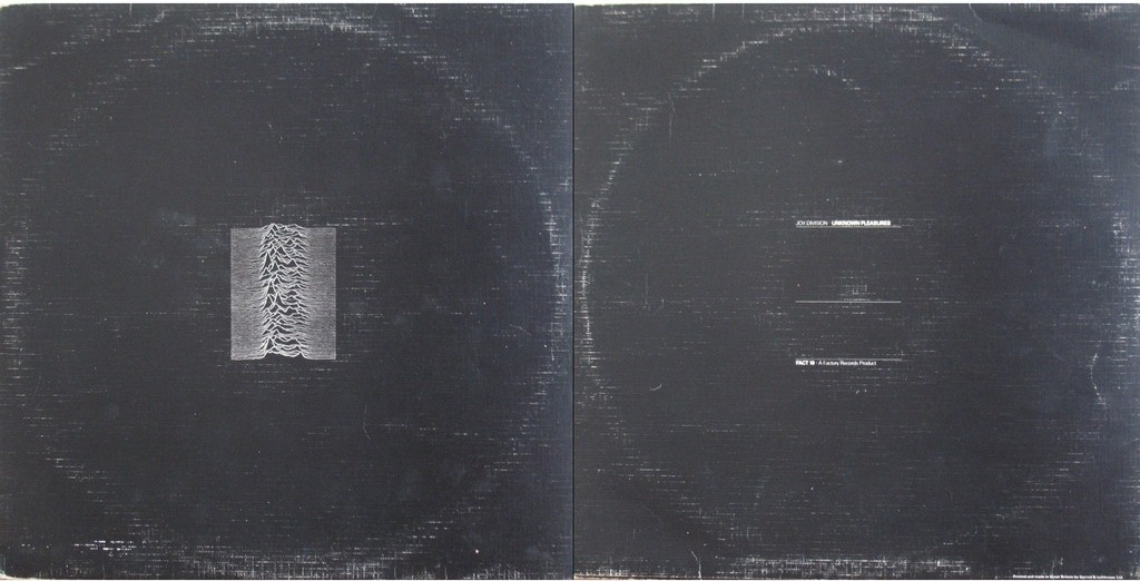
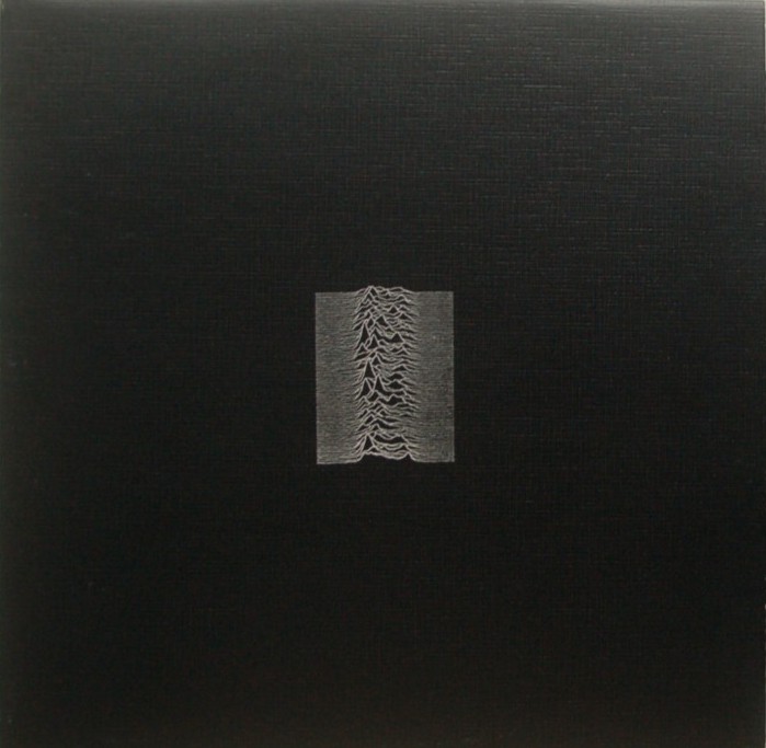 Ever since Unknown Pleasures was released audiences have enjoyed discovering and, even better, informing others that the unspecified picture on the front cover, comprised of series of jagged white lines set against a stark black background, is based on a scientific diagram of an astrophysical object known as a pulsating star or ‘pulsar’. As Saville explained, it is not unusual for a band to suggest images for their first album and, in this respect, Joy Division were no exception. Instead of a design brief with the band members or Factory records, their manager Rob Gretton gave Saville an A4 folder that included a diagram of a pulsar from a page in the 1977 Cambridge Encyclopaedia of Astronomy plus a reproduction of a monochrome photograph by Ralph Gibson depicting a hand reaching for a door handle. The pulsar diagram was provided by the band’s drummer, Stephen Morris, and Saville recalls being intrigued by its graphical properties as well as the remote and mysterious astronomical object it depicted. Embedded in a scientific publication the repetition of almost, but not quite, identical jagged lines stacked above each other served as an illustration and evidence of the mathematical uniformity of radio wave emissions from the first recording of a pulsar made in 1968. Even though Saville had not yet heard any of the tracks on Unknown Pleasures, the repetitive features of the pulsar diagram reminded him of Morris’ machine-like drumming style.
The first scientific account of the rapidly pulsating radio source, originally referred to as ‘CP 1919’ before being dubbed ‘pulsar’ by science journalist Anthony Michaelis, was reported in 1968 by the astronomer James Hewish and his colleagues in the scientific journal Nature. The article was based on work conducted by Jocelyn Bell and other members of Hewish’s research team at Mullard Radio Observatory, Cambridge. Unlike the picture of CP 1919 on the album cover, the article in Nature visualized the regular pulsar radio emissions acquired with a radio telescope using diagrams that consisted of two or three jagged lines or pen traces of the pulses. Scientific articles published in the wake of the Nature article, usually displayed observations of pulsars as numbers in tables and chart recordings of pulse trains presented as a single line rather than multiple lines stacked on top of each other. An exception is the CP 1919 pulsar picture in a Scientific American article published in 1971, which looks identical (except for the colour palette) to the version spotted by Morris in the book on astronomy. The diagram that comes closest to Saville’s version was published not in a scientific journal but, rather, in an arts journal namely Graphis: The international Journal of Visual Communication special issue on The Artist in the Service of Science.
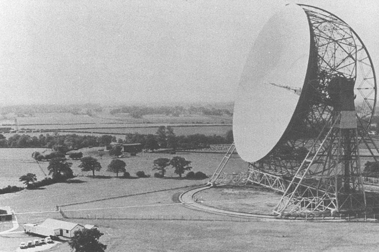 Interestingly, the association between scientific research on pulsars and the Unknown Pleasures album cover is not wholly explained by Stephen Morris’ inspired proposal to use the diagram from Cambridge Encyclopaedia of Astronomy. In 1957, Morris was born in Macclesfield and this happens to be the same year that construction work on radio telescope at Jodrell Bank was completed. The massive 125 foot (75 meter) diameter dish of the radio telescope was located approximately ten miles from where Morris was born and raised. During his childhood he often cycled to Jodrell Bank to gaze at the radio telescope and ponder how it was used to study stars and other distant objects in the depths of space. Morris’ trips to Jodrell Bank left a lasting impression and, perhaps, influenced his subsequent interest in pulsars to the extent that a diagram of these remote astronomical objects served a dual purpose of rekindling his memories of the mysterious radio telescope Jodrell Bank and the dark otherworldly music and style he and his fellow band members created for Unknown Pleasures.
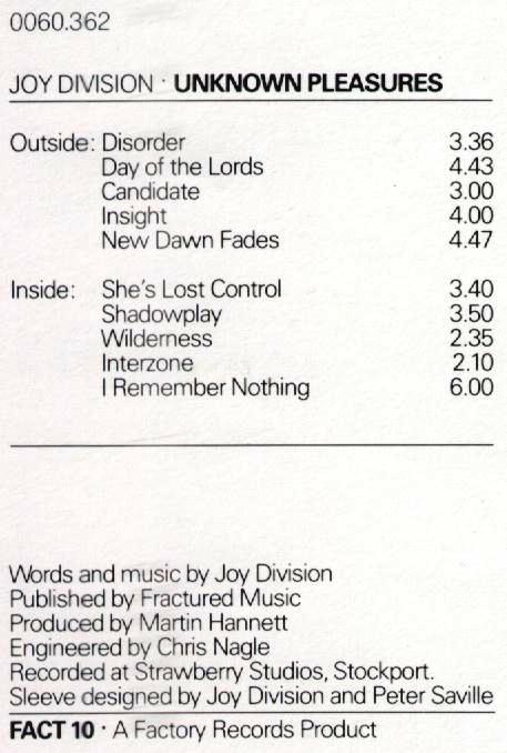
Saville’s design work for the album was more sophisticated and nuanced than simply appropriating a picture of a pulsar. On the original album cover, the size of the pulsar image is reduced to the extent that it occupies a relatively small area in the centre and virtually the entire surface of both the front and back cover is coloured black. The composition and colour pallete (or lack of colour) created the impression of a black background that accentuates the ambivalent feature made up of recursive white lines. Again, the reverse cover is completely black except for minimal text printed in small white typeface. The subtleness of Saville’s design is also evident in the pictures and lettering on the inner cover and record labels.
The typeface used on Unknown Pleasures is a design feature that has received considerably less attention than the pulsar picture. However, typography constitutes a critical component of not only the album cover but also Factory Records and a myriad of related cultural artifacts and Manchester-based projects, such as early Factory gigs at the Russell Club/PSV, the Hacienda nightclub (FAC 251), and Dry Bar (FAC 201).
During his studies as an undergraduate design student, Saville developed a keen interest in typography, particularly the work of European typographers such as the designer and calligrapher Jan Tschichold (1902-1974) who created distinctive modern typographical style and sans serif typefaces. From the early 1920s, Tschichold was profoundly influenced by the Bauhaus school and the new abstract painting. He played a major role in producing and promoting a new movement that created a unique style of typography that was aligned with the rationalism of the modern age. His philosophy and principles regarding the functional use and aesthetics of Modernist typography were published in his 1928 book Die neue Typographie (The New Typography), which is a pivotal work in what became known as the International Typographic Style or Swiss Style of graphic design developed in Switzerland in the 1950s.
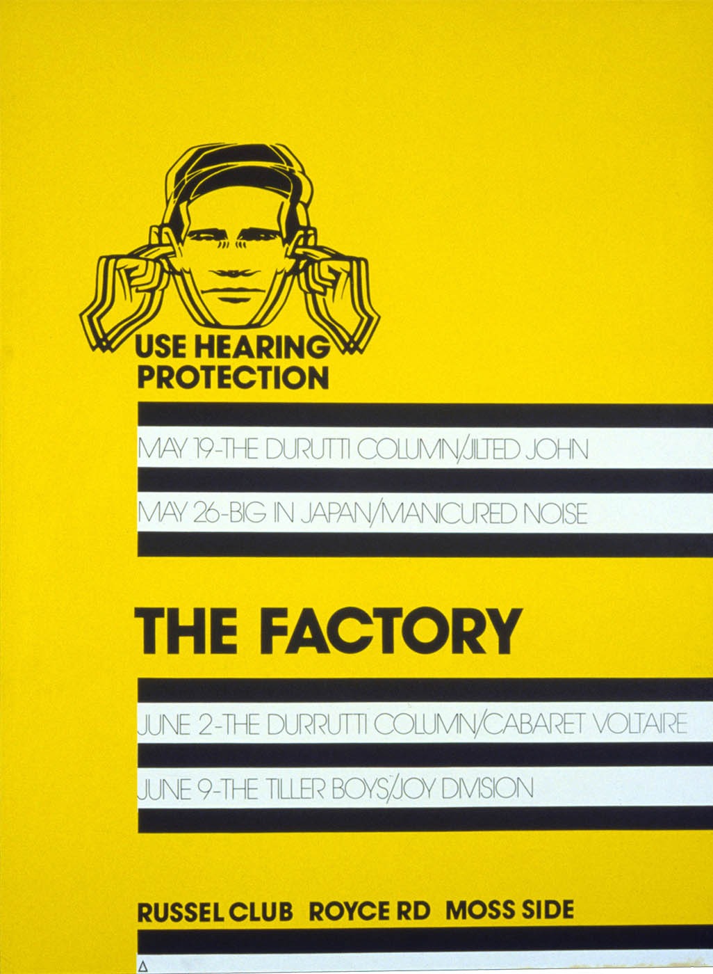 According to the folklore surrounding Factory, in early 1978, Saville’s enthusiasm for Tschichold’s typography surfaced in an impromptu meeting with Mancunian cultural entrepreneur and co-founder of Factory Records Tony Wilson. Saville took the opportunity to present Wilson with examples of typography from Tschichold’s book and offered to use similar typography and design principles to create a poster for a music event at The Factory nightclub. He was hired for the job and created the poster (FAC 1) that combined the typography inspired by Tschichold and a BSI (British Standards Institute) style noise hazard warning, neatly referring to both the minimalist Swiss Style and Manchester’s industrial history. Unlike Andy Warhol’s post-Fordist Factory in NYC that focused on manufacturing glamorous superstars, mass produced works of art, and icons of pop culture, Factory Records appropriated the iconography, narratives, and buildings of Manchester’s industrial past and post-industrial present. Factory mobilized Manchester’s reputation as a ‘shock city’ of the nineteenth century industrial revolution, but manufactured music and other forms of culture rather than commodities created according to the strict demands of profit.
Saville’s interest in typography and his talent for creating unique graphic designs that combined Swiss Style design principles of economy, clarity, and optimal communication is exemplified in his choice of typeface and typographical style for Unknown Pleasures. In line with Tchichold’s principles, Saville used the sans serif Helvetica typeface. The front cover is completely devoid of text, adding to the anonymity of the pulsar image, and minimal text is featured on the reverse side of the cover, inside cover, and record labels. As with all items produced by Factory, the album was given a catalogue number in this instance FAC 10, another reference to the process of manufacturing objects in industrial factories.
 Interestingly, the Helvetica typeface on the Unknown Pleasures album was introduced in the 1950s and quickly became the hallmark of the Swiss Style promoted by Tschichold and others. Since its introduction, Helvetica has been used by designers to because it lacks ornamentation or overt reference to other fonts. Companies such as Penguin Books, Tupperware, Hoover, Lufthansa, to name a few, used the typeface to create a brand identity.
From 1955 to 1967, Tschichold worked as design consultant for the Swiss pharmaceutical company Hoffmann La-Roche, which was one of many companies that use Helvetica on their products to create a corporate identity and, importantly, packaging and information sheets for a wide range of pharmacological products. Product packaging and labelling used by Hoffmann La-Roche and other international drugs companies are designed for optimal legibility and lack of embellishment to ensure safe use in domestic as well as clinical settings. The adoption of Swiss Style typefaces by pharmaceutical companies since the 1960s was partly driven by changes in legislation in US and other countries, following the widespread prescription of thalidomide to pregnant women that resulted in severe birth defects in thousands of children.
Hoffmann La-Roche was, and still is, one of the major suppliers of benzodiazepines, often referred to as anti-depressants and described in early adverts as ‘mood brighteners’, such as Librium and Valium (Diazepam). During the 1970s, there was a growing trend of UK General Practitioners and clinicians over prescribing benzodiazepines that peaked in 1979 with 20 million prescriptions being written in a single year. The problems of dependence and side effects were a contributory factor in the inclusion of data sheets inserts and product packaging of Valium and other antidepressants warning of the risks and side-effects from long-term use. At the time Unknown Pleasures was released, Helvetica and other Swiss Style fonts were routinely used by pharmaceutical companies to convey important information about their products to patients and clinicians.
 It is ironic that Ian Curtis experienced episodes of depression and the typeface used on the cover of Unknown Pleasures was the same as packaging used for the drugs widely used to treat depression. Minimalist graphic design and typography used by Saville on Unknown Pleasures are consistent with the clinical precision and functionality of packaging designed to convey information without ornamentation or overt reference to other graphical styles. In many ways the typeface is an ideal choice for the sombre and introspective post-punk era, worlds apart from the furious annihilation of mainstream culture and commercial packaging unleashed by designers such as Jamie Reid with his album cover design for the 1977 Sex Pistols single God Save the Queen.
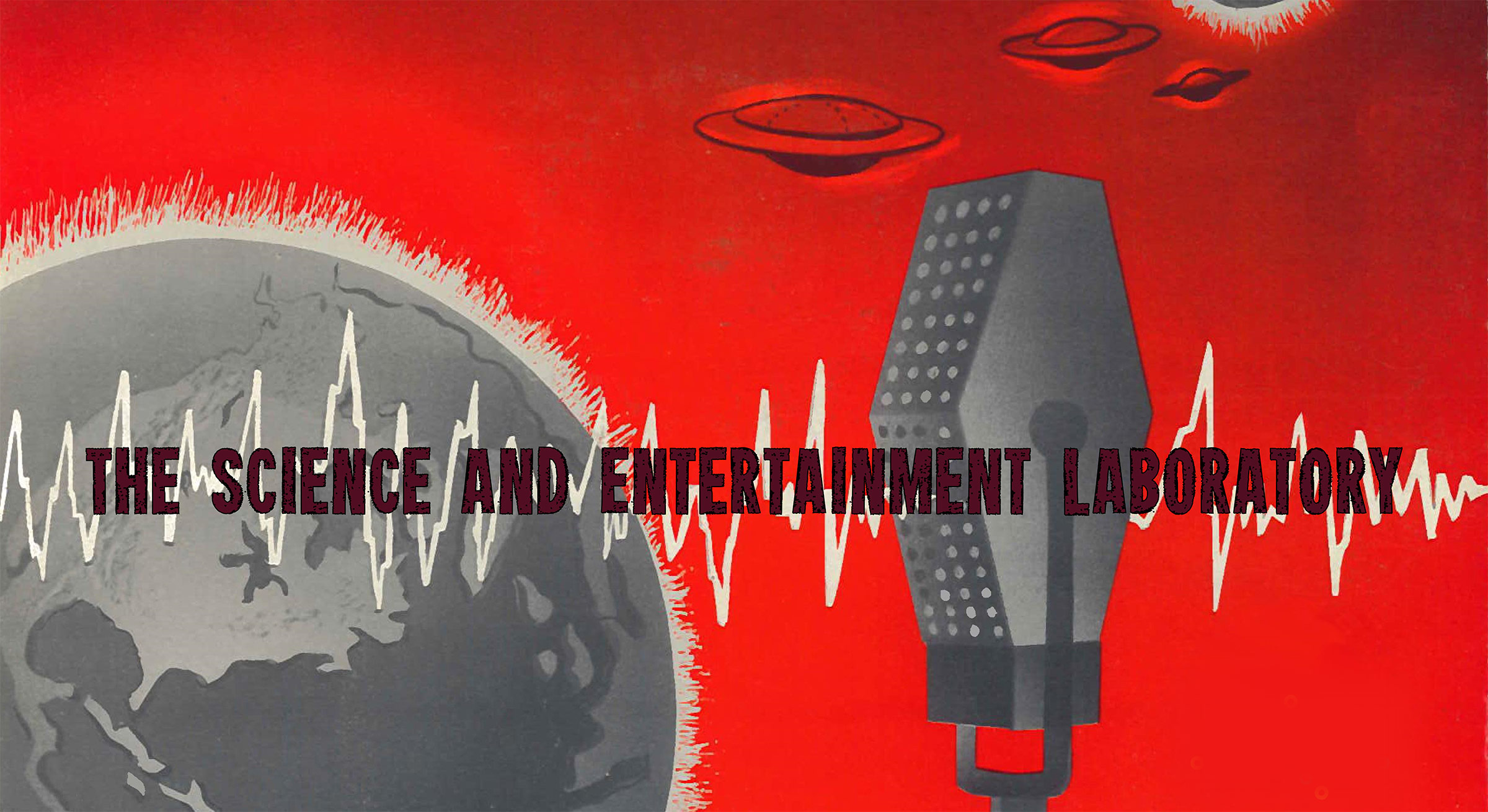
Prior to the release of Unknown Pleasures, pulsars were characterized in scientific literature and popular science as remote otherworldly objects undergoing a slow death while transmitting faint radio signals that can be observed, recorded, and measured as visual traces on chart paper or heard as steady pulses of sound using scientific instruments. Some of these associations resonate with Joy Division’s music and lyrics plus Peter Savlille’s complementary graphic design, all of which coalesced into a unique and significant cultural product under the auspices of Factory Records. The relationship between the music featured on Unknown Pleasures and the pulsar diagram was also created by sound producer Martin Hannett’s innovative recording and mixing techniques that resulted in the cavernous, sparse, and dark sonic quality of tracks such as Wilderness as well as the haunting and glacial soundscape of the album as a whole.
The enduring appeal of Unknown Pleasures is partly on account of the complementarity or interplay between Joy Division’s music and Saville’s cover design. Both the sonic and visual presentation of Unknown Pleasures combines local talent and working practices with signifiers of international marketing (though not yet global in a postmodern or neoliberal sense). The audiovisual components of the album are delicately poised between vaguely familiar and strange – at one and the same time a half-forgotten memory and a vision of the future. Unknown Pleasures produced by skilled workers in the shadowlands of Manchester factories and transmitted across space and time. The album neatly demonstrates how craft skills applied in the design, production, and circulation of audiovisual media can be deployed on a collaborative project that blurs categorical distinctions between science and art, sound and music, local and universal, avant-garde and mainstream, familiar and strange.
 Follow